Propel(x), a leading platform for alternative investments and syndicates-as-a-service, seeks to transform its homepage into a more engaging and informative digital space.

About Project
Propel(x), a leading platform for alternative investments and syndicates-as-a-service, seeks to transform its homepage into a more engaging and informative digital space. This redesign will focus on enhancing clarity, visual appeal, and streamlined navigation to better communicate the company's value to potential investors and syndicators. Key goals include immediately showcasing the benefits of Propel(x), creating intuitive navigation, implementing a modern design that aligns with fintech industry standards, optimizing the display of investment offerings, and prioritizing accessibility throughout the design process. Ultimately, this project aims to increase user engagement, strengthen the Propel(x) brand, and improve overall user satisfaction with the platform.
Planning
As the design strategist, my role was to define the overarching approach for the project. This involved understanding the user's needs and business goals, conducting market research, and outlining the design direction to ensure alignment with the project's objectives.
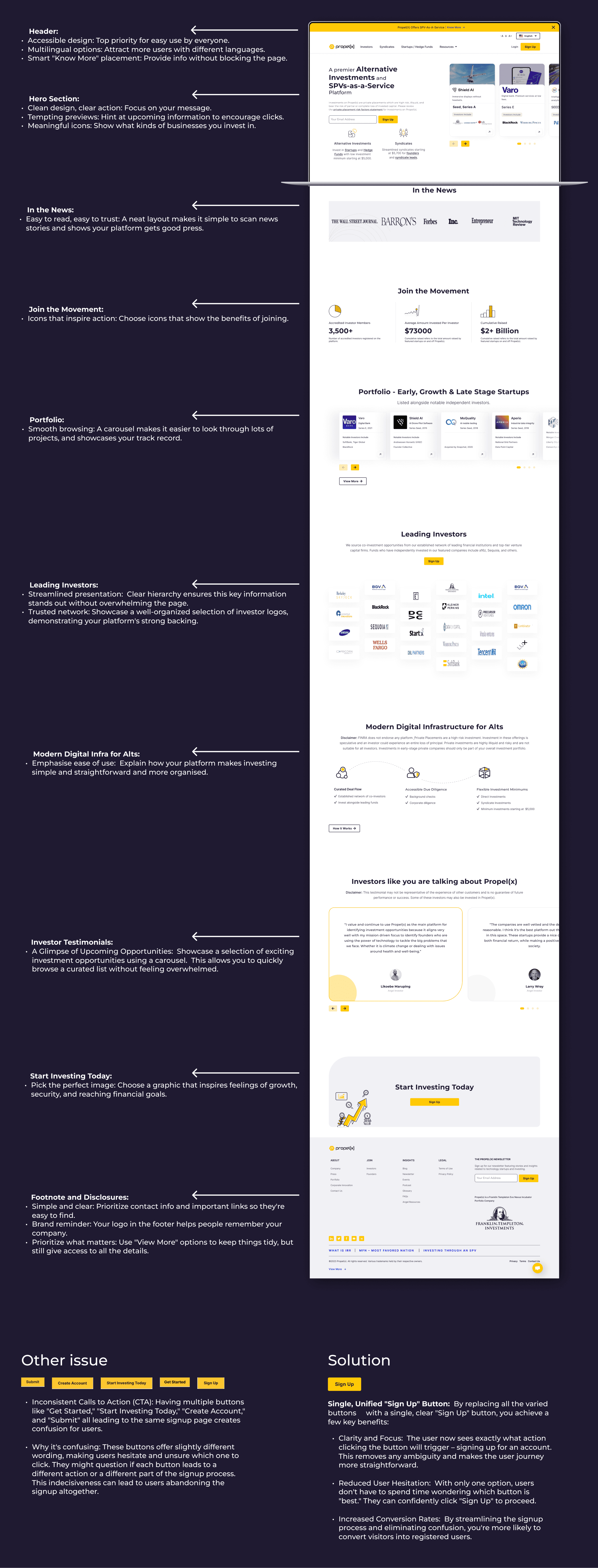
CTA Button Overloading
The current banner section design overwhelms users with likely featured multiple calls to action, create confusion and distract from the core message.
Poor Content Structure
The old design likely lacked clear content hierarchy and effective use of visual cues, making it difficult for users to find what they need.
Visual Clutter
The old homepage probably suffered from a cluttered layout, excessive text, or irrelevant graphics.
Focused CTAs
Limit the banner to one or two primary CTAs and position secondary actions strategically throughout the page.
Strategic Content Flow
Prioritize key information "above the fold". Use headings, lists, and icons at right placeto guide the user's eye and improve scannability.
Enhanced Interaction
Utilize whitespace effectively, choose relevant graphics , and align the design with contemporary trends.
01
Craft a visually captivating design that resonates with the dynamic nature of the fashion industry, blending sophistication with professionalism to appeal to global business professionals.
02
Develop a responsive design optimized for various mobile devices, offering users a seamless browsing experience on smartphones and tablets to access event information and networking opportunities on-the-go.
03
Enhance user engagement by providing interactive features and networking functionalities, encouraging active participation and collaboration among users.
04
Prioritize user experience by implementing intuitive navigation and user-friendly interface elements, facilitating effortless exploration of event listings and networking options

Old website issues analysis
Framing a new concept idea & suggestions
UX wireframing on high, low fidelity.
UI design of the template
Add interaction on template
Development optimisation testing
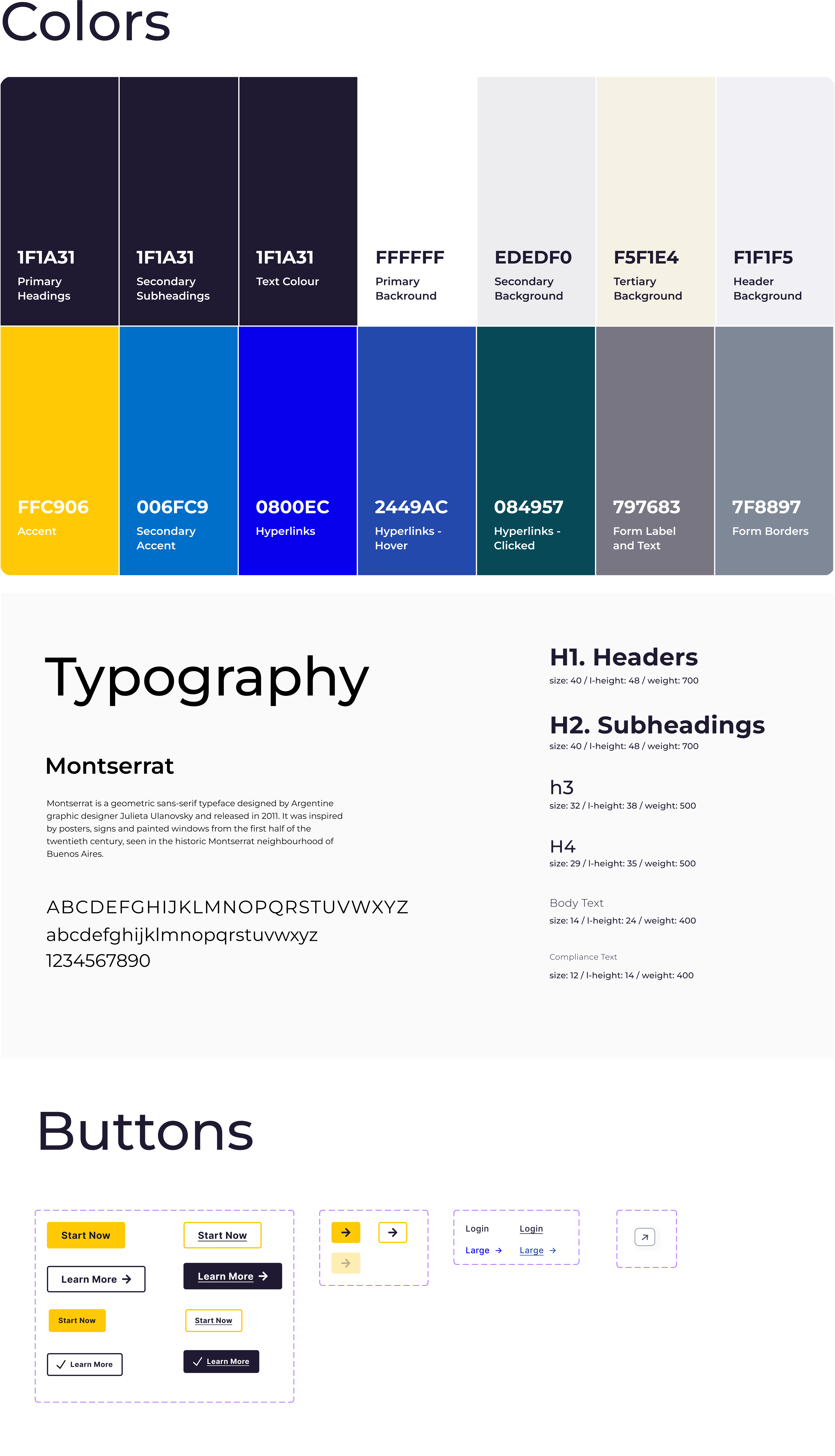
Typography And Colors
Typography and color choices play a significant role in our project's visual design. By selecting appropriate fonts and color schemes, we can enhance readability, create visual hierarchy, and evoke the desired emotions or associations, ultimately contributing to a more engaging and cohesive user experience.
Mid-Fidelity Wireframes
Now that I had a general idea of some of the specific tasks the user wanted to complete, it was time to begin the design process. I used the wireframe structure to create a low-fidelity prototype. This was useful when determining how enjoyable and functional the current design was during this stage.
Final Design
The high-fidelity wireframe is the culmination of our design efforts, showcasing the polished visuals and interactions of the product. By presenting a realistic representation of the final design, we can communicate our vision effectively to stakeholders and developers, ensuring a smooth transition from design to implementation.
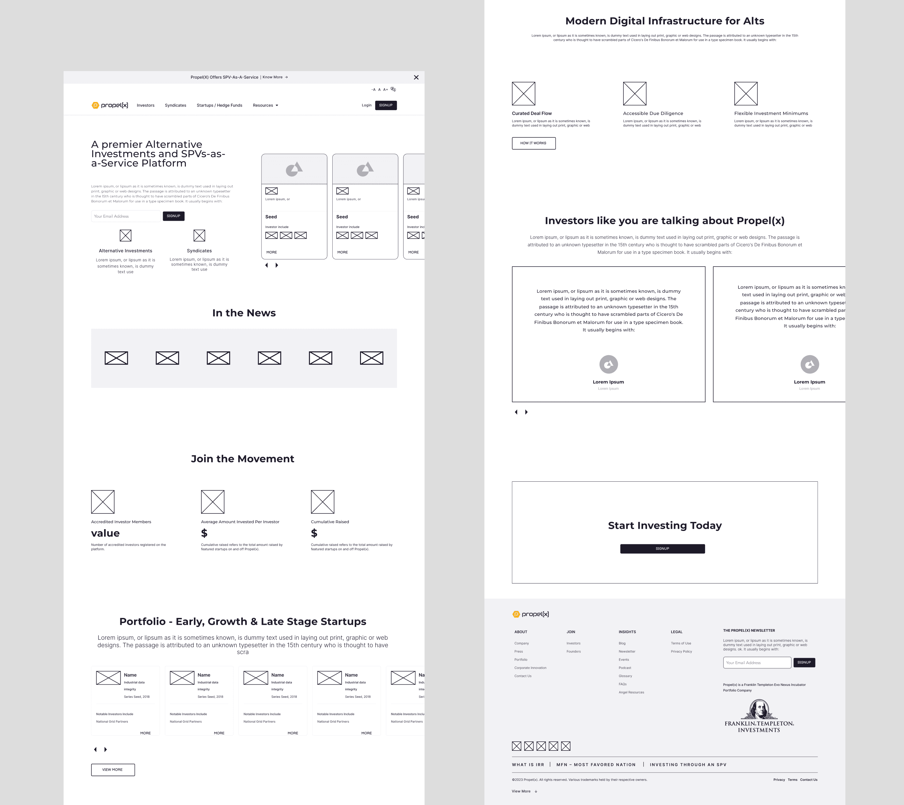
Old Design

New Redesign

Case Studies


Drawing boxes since 2020
Thank you for your interest in my work. Lets connect!