
About Project
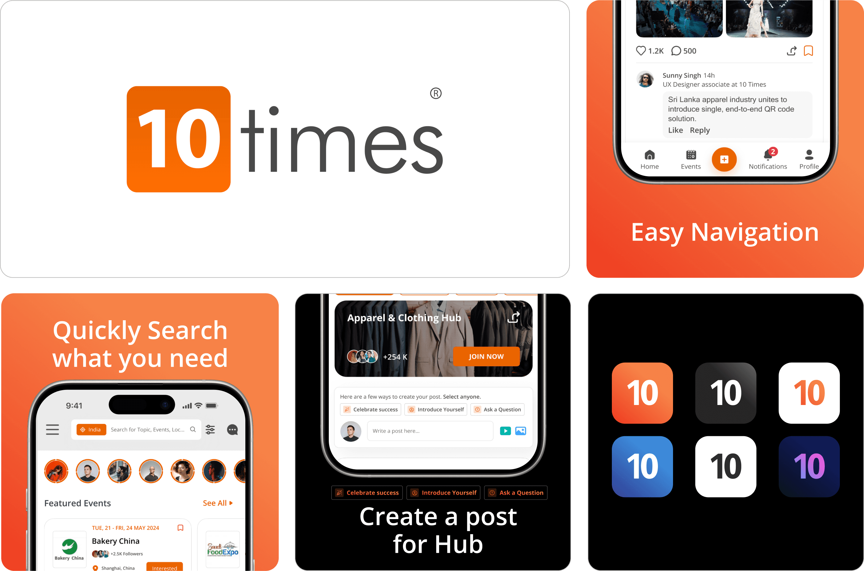
10Times, a well-known event discovery platform, connects global business professionals with relevant events and networking opportunities. However, their Hub page, particularly on mobile, struggles with low user engagement. By redesigning this page, I aim to enhance user engagement through easy navigation, streamlined content presentation, and interactive features. The goal is to create a seamless mobile experience so that users feel encouraged to connect, share, and explore events, making 10Times even more valuable to its users.
Planning
As the design strategist, my role was to define the overarching approach for the project. This involved understanding the user's needs and business goals, conducting market research, and outlining the design direction to ensure alignment with the project's objectives.
Information Density
Dense, text-heavy sections make it hard for users to quickly find what they need.
Limited Interactivity
he current design lacks engaging features beyond basic posting, potentially reducing user engagement.
Visual Balance
Implement a balanced color scheme to highlight important areas without overwhelming users.
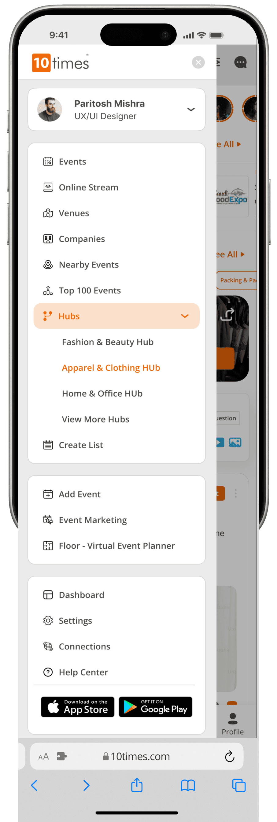
Content Organization
Space out content, use bullet points, and icons for easier scanning and understanding.
Enhanced Interaction
Prioritize followed users' posts, add sticky post button, include save icons, and notify of connection comments.
01
Craft a visually captivating design that resonates with the dynamic nature of the fashion industry, blending sophistication with professionalism to appeal to global business professionals.
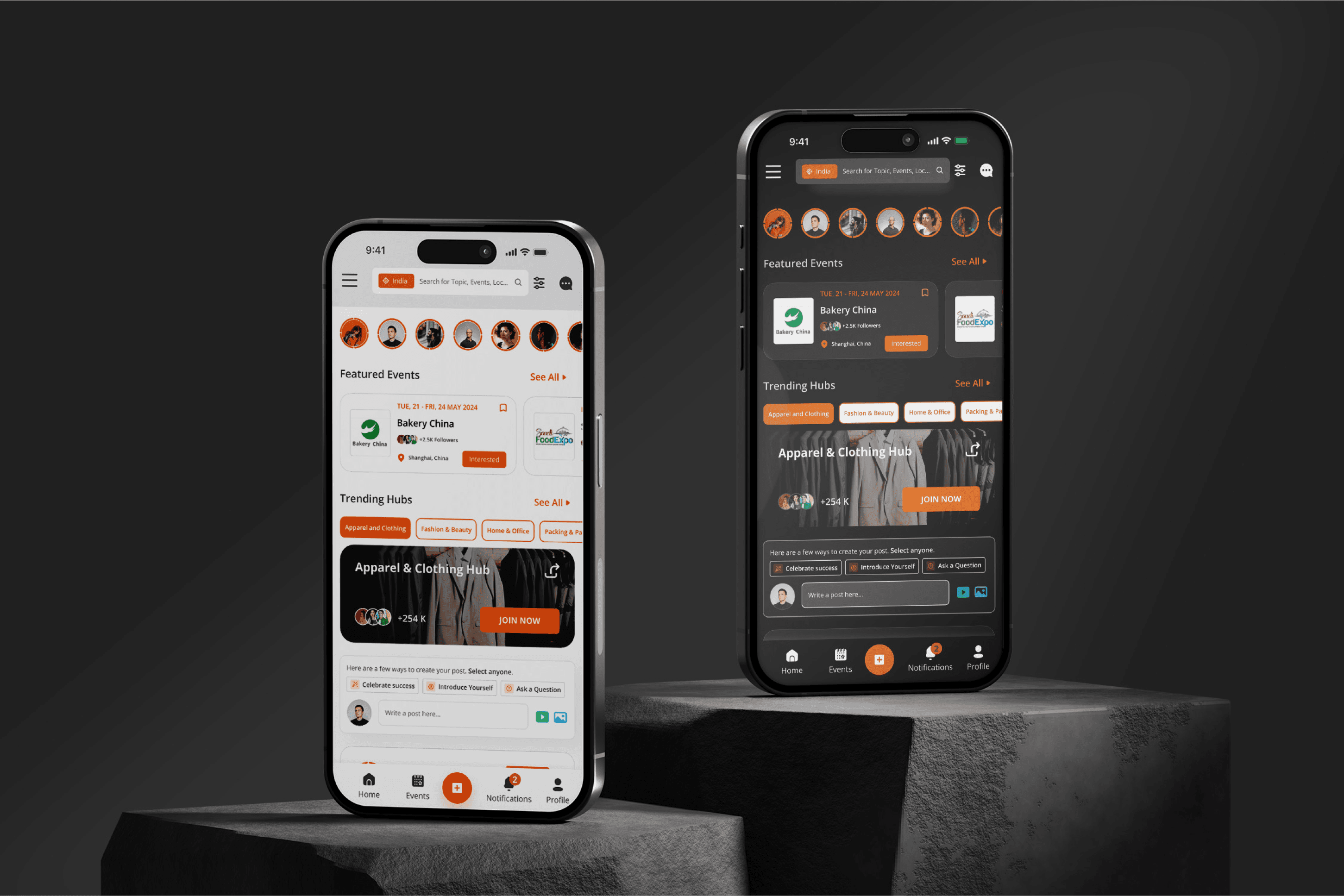
02
Develop a responsive design optimized for various mobile devices, offering users a seamless browsing experience on smartphones and tablets to access event information and networking opportunities on-the-go.
03
Enhance user engagement by providing interactive features and networking functionalities, encouraging active participation and collaboration among users.
04
Prioritize user experience by implementing intuitive navigation and user-friendly interface elements, facilitating effortless exploration of event listings and networking options
Framing a new concept idea & suggestions
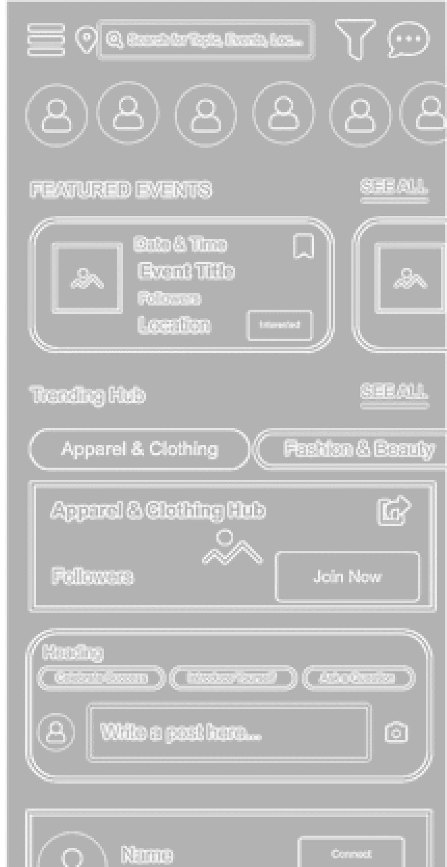
UX wireframing on high, low fidelity & mid fidelity
UI design of the template
Add interaction on template
Development optimisation testing
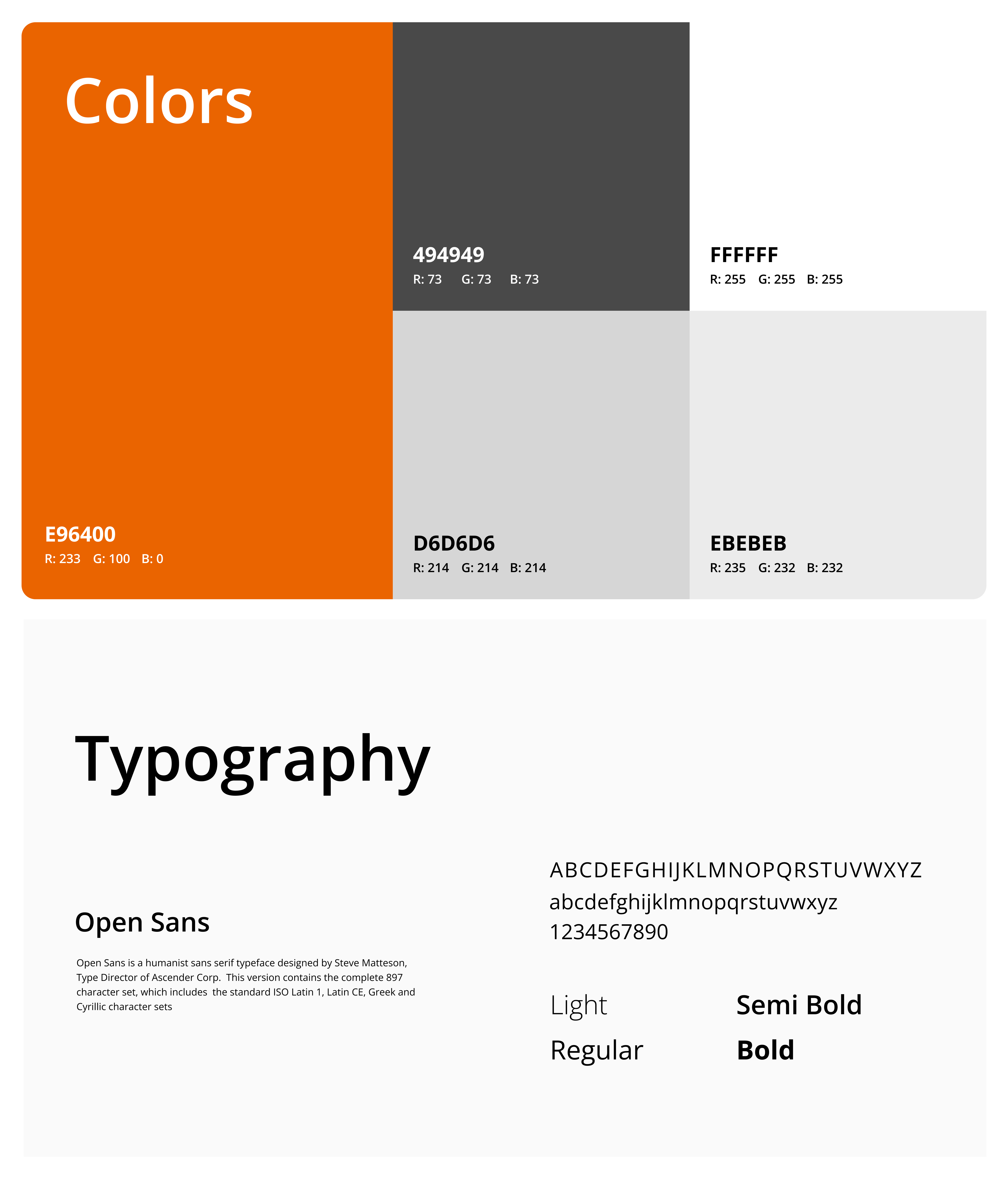
Typography And Colors
Typography and color choices play a significant role in our project's visual design. By selecting appropriate fonts and color schemes, we can enhance readability, create visual hierarchy, and evoke the desired emotions or associations, ultimately contributing to a more engaging and cohesive user experience.

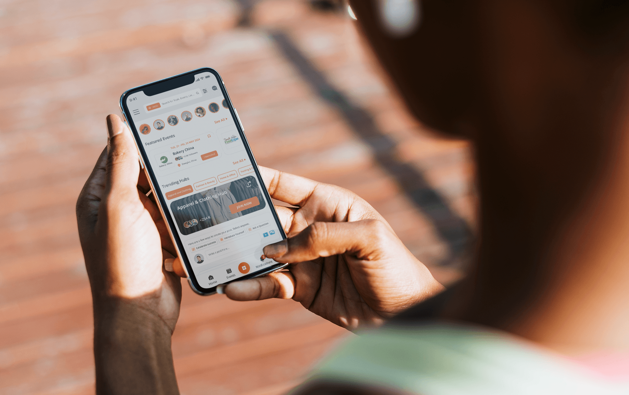
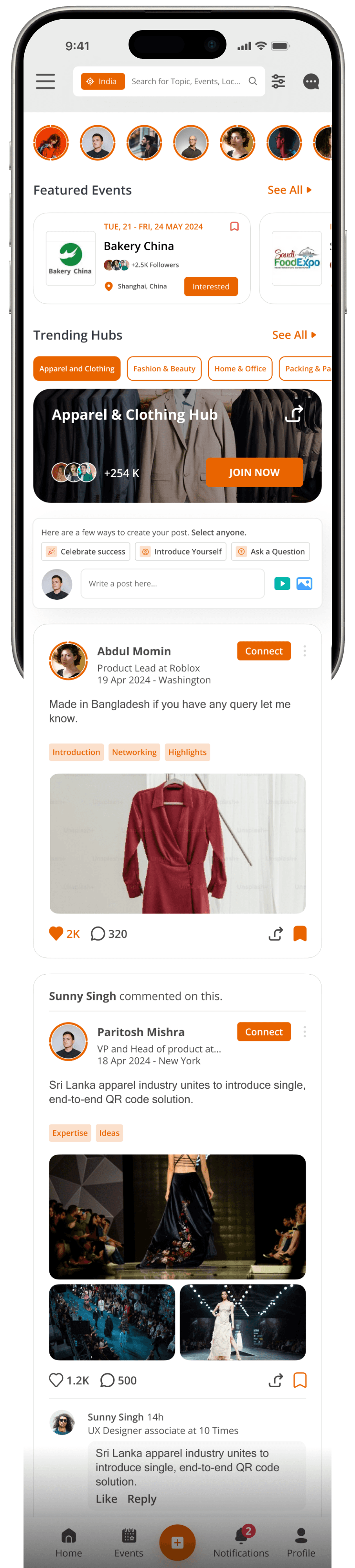
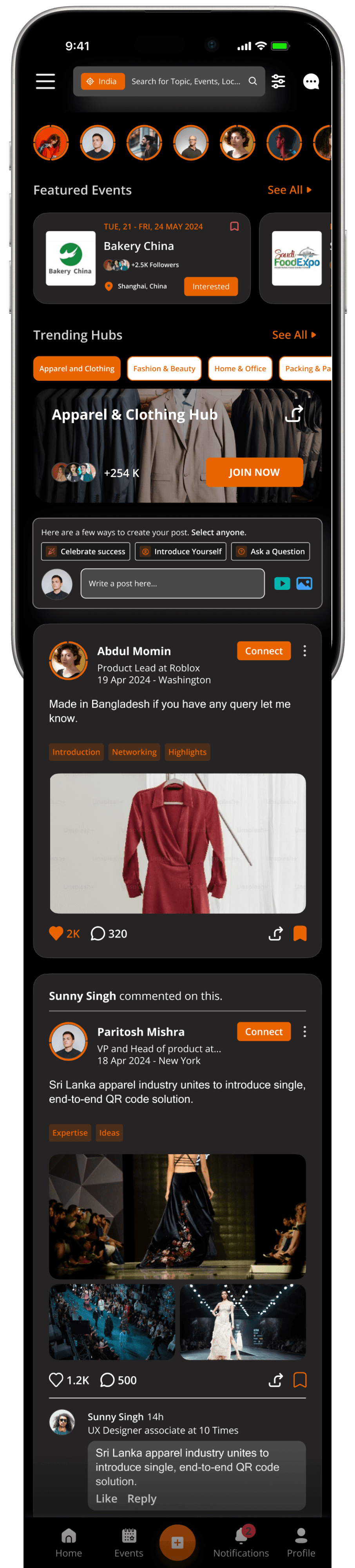
Final Design
The high-fidelity wireframe is the culmination of our design efforts, showcasing the polished visuals and interactions of the product.

Case Studies


Drawing boxes since 2020
Thank you for your interest in my work. Lets connect!