Propel(x), a leading platform for alternative investments and syndicates-as-a-service, there current Manage Investors page has information overload and a lack of organizational clarity.

Problem
The current Manage Investors page for the Propel(x) platform suffers from information overload and a lack of organizational clarity. This makes it difficult for Syndicate Leads and admins to efficiently manage investor data, track statuses, and take necessary actions.
Goal
The redesign aims to create a refined Manage Investors experience. The focus is on:
Improving clarity and promoting rapid scanning of investor information.
Establishing a strong visual hierarchy that guides users towards essential actions.
Streamlining user interactions, from inviting new investors to updating investor statuses.
Target Audience
The redesigned Manage Investors page primarily targets two user groups:
Syndicate Leads/Founders: Who use the platform to set up and manage their syndicates, and directly interact with investors.
Propel(x) Internal Team: Who have administrative privileges and need to view detailed investor information, upload documents, and manage fund statuses.
Old website issues analysis
Framing a new concept idea & suggestions
UX wireframing on high, low fidelity & mid fidelity
UI design of the template
Add interaction on template
Development optimisation testing
Information Architecture
The strategic organization and labeling of content within the product to ensure it is logical, intuitive, and user-friendly. Information Architecture involves structuring the content so that users can easily navigate and find the information they need. This process includes creating sitemaps, navigation systems, and defining the relationships between different content pieces to enhance overall usability and user experience.
CRAFTING CLARITY AND NAVIGATING COMPLEXITY

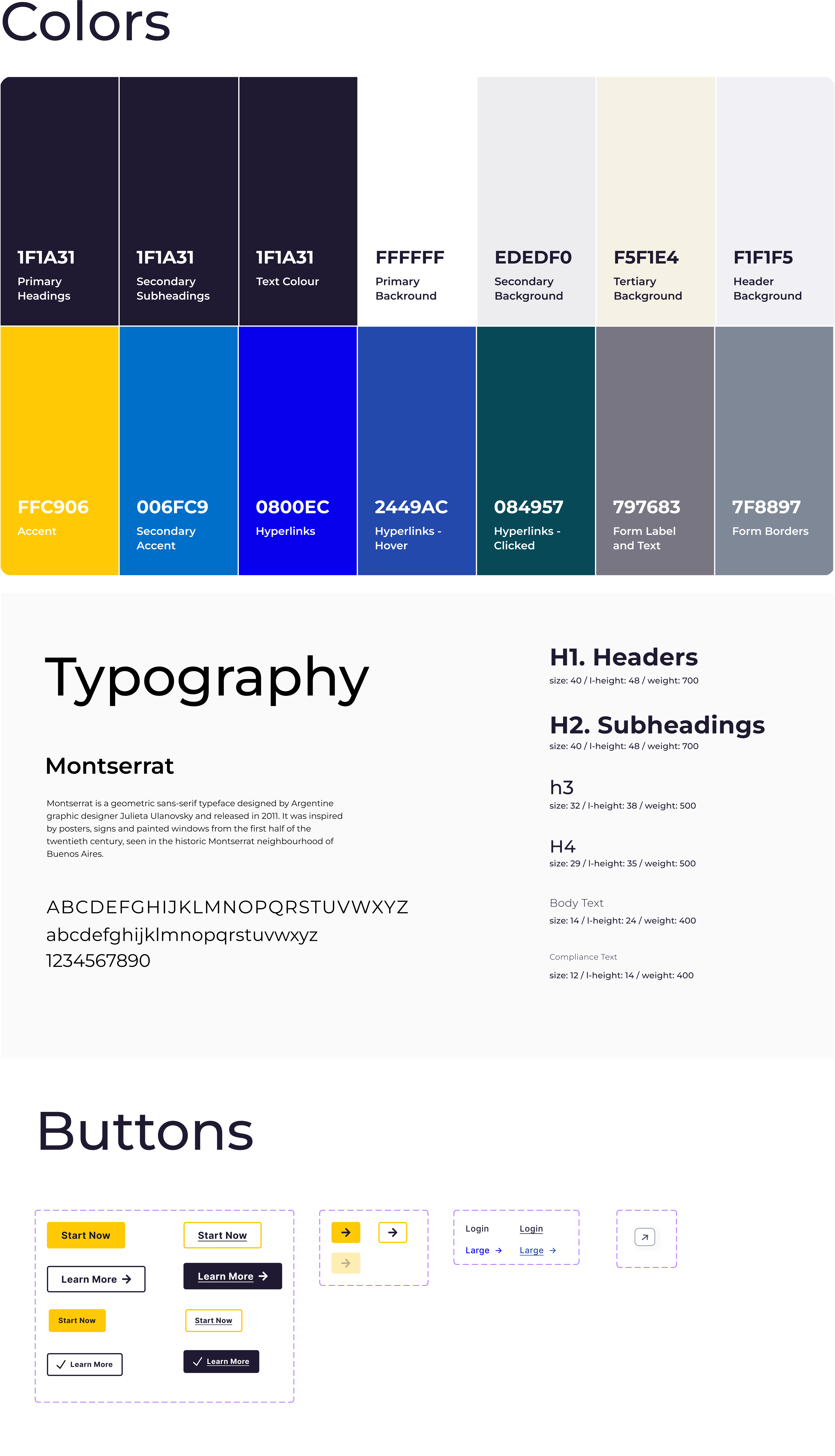
Typography And Colors
Typography and color choices play a significant role in our project's visual design. By selecting appropriate fonts and color schemes, we can enhance readability, create visual hierarchy, and evoke the desired emotions or associations, ultimately contributing to a more engaging and cohesive user experience.
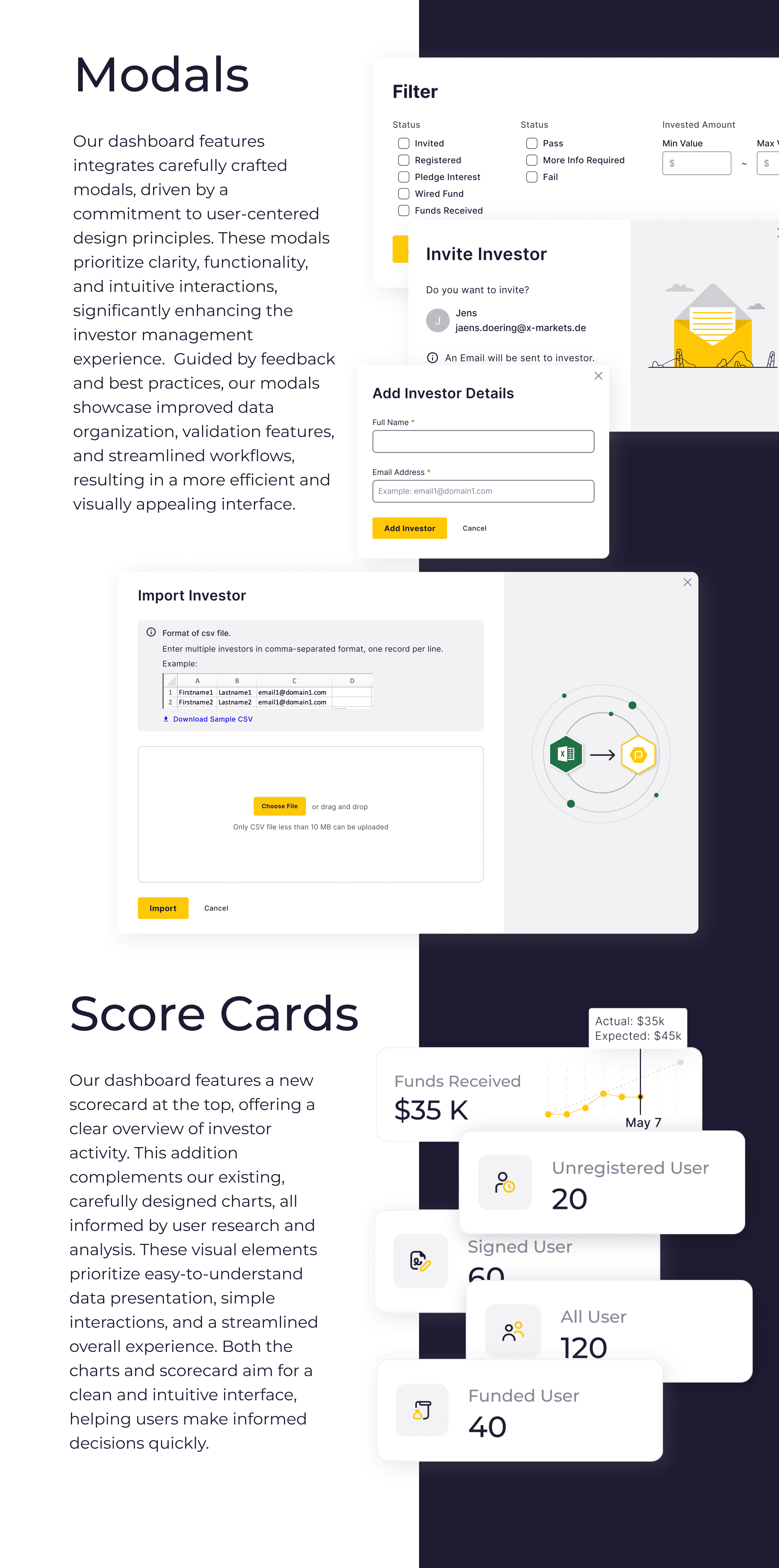
Final Design
The high-fidelity wireframe is the culmination of our design efforts, showcasing the polished visuals and interactions of the product.

Tables
Our UI employs a well-organized table system, designed to present data clearly and efficiently. The table structure prioritizes readability, with a visual hierarchy guiding the user's eye through crucial information. Integrated sorting, filtering, and search tools enable rapid navigation and targeted data analysis. This optimized layout facilitates seamless exploration and comparison, empowering users to make informed decisions quickly. Additionally, the expandable row option provides in-depth investor details on demand, maintaining a comprehensive overview while offering greater analytical depth.

Final Design
The high-fidelity wireframe is the culmination of our design efforts, showcasing the polished visuals and interactions of the product.
Case Studies

Drawing boxes since 2020
Thank you for your interest in my work. Lets connect!