Education app case study
Problem
Design a responsive learning report page for an online learning platform aimed at students aged 12 to 14. The learning report should provide students with a comprehensive overview of their learning progress, key insights, and actionable recommendations to enhance their learning experience.
Solution
Create a user-friendly learning report page that offers students insights into their learning journey across multiple subjects that they may have subscribed to. The page should address the following aspects:
Progress Overview: Display a clear and concise summary of completed lessons, assignments, and assessments, highlighting progress made in each subject.
Key Insights: Present meaningful insights based on the student's performance, such as strengths, areas for improvement, and study patterns.
Actionable Recommendations: Provide personalized recommendations for further study, including suggested topics, resources, and interactive activities.
Visual Appeal: Design an interface that is visually appealing and engaging, using appropriate colors, icons, and imagery suitable for the target age group.
Approach Taken
Understanding User Needs and Preferences: Deeply understand the target audience - students aged 12 to 14, focusing on their preferences for personalised insights and actionable recommendations to enhance their learning journey.
Mobile-First Design: Optimize the entire UI/UX design for mobile devices, ensuring responsiveness across various screen sizes and prioritizing content and features based on mobile usability patterns.
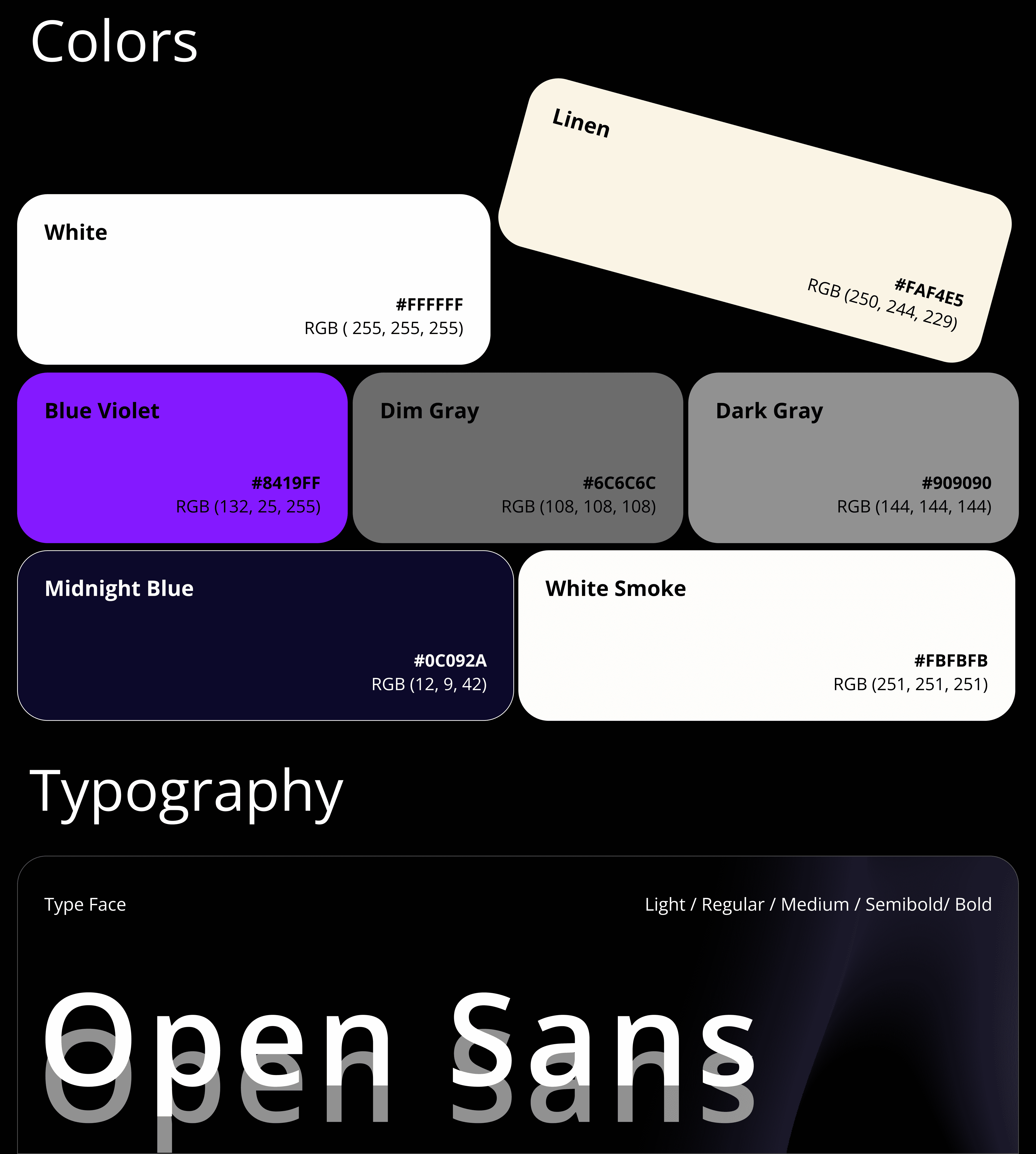
Visual Appeal and Engagement: Incorporate vibrant colors, playful icons, and age-appropriate imagery to capture the attention and interest of young users while emphasizing clarity in communication of insights and recommendations.
Personalization and Progress Tracking: Provide a detailed insights into overall study progress across subjects, chapters, and individual topics, accompanied by actionable recommendations tailored to each user's performance and study patterns.
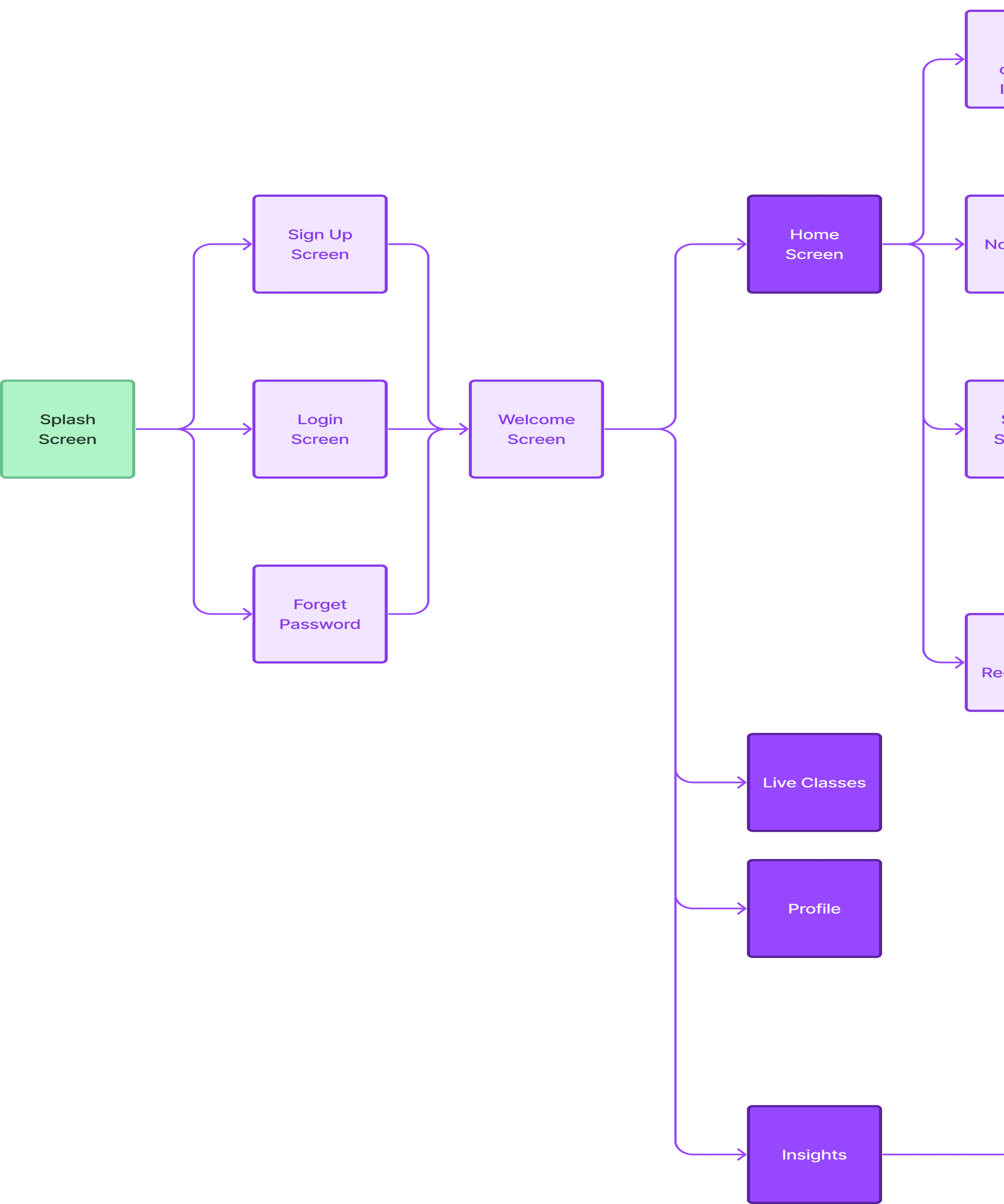
Streamlined Navigation: Offer clear pathways for users to navigate through the platform, simplifying access to insights, recommendations, and study materials within subjects and chapters.
Interactive Elements and Feedback: Use interactive elements such as progress indicators, action buttons, and notification features to provide immediate feedback and encourage engagement with insights and recommendations.
Assumptions & Focus Area
As the design strategist, my role was to define the overarching approach for the project. This involved understanding the user's needs and business goals, conducting market research, and outlining the design direction to ensure alignment with the project's objectives.

Information Architecture
The strategic organization and labeling of content within the product to ensure it is logical, intuitive, and user-friendly. Information Architecture involves structuring the content so that users can easily navigate and find the information they need. This process includes creating sitemaps, navigation systems, and defining the relationships between different content pieces to enhance overall usability and user experience.


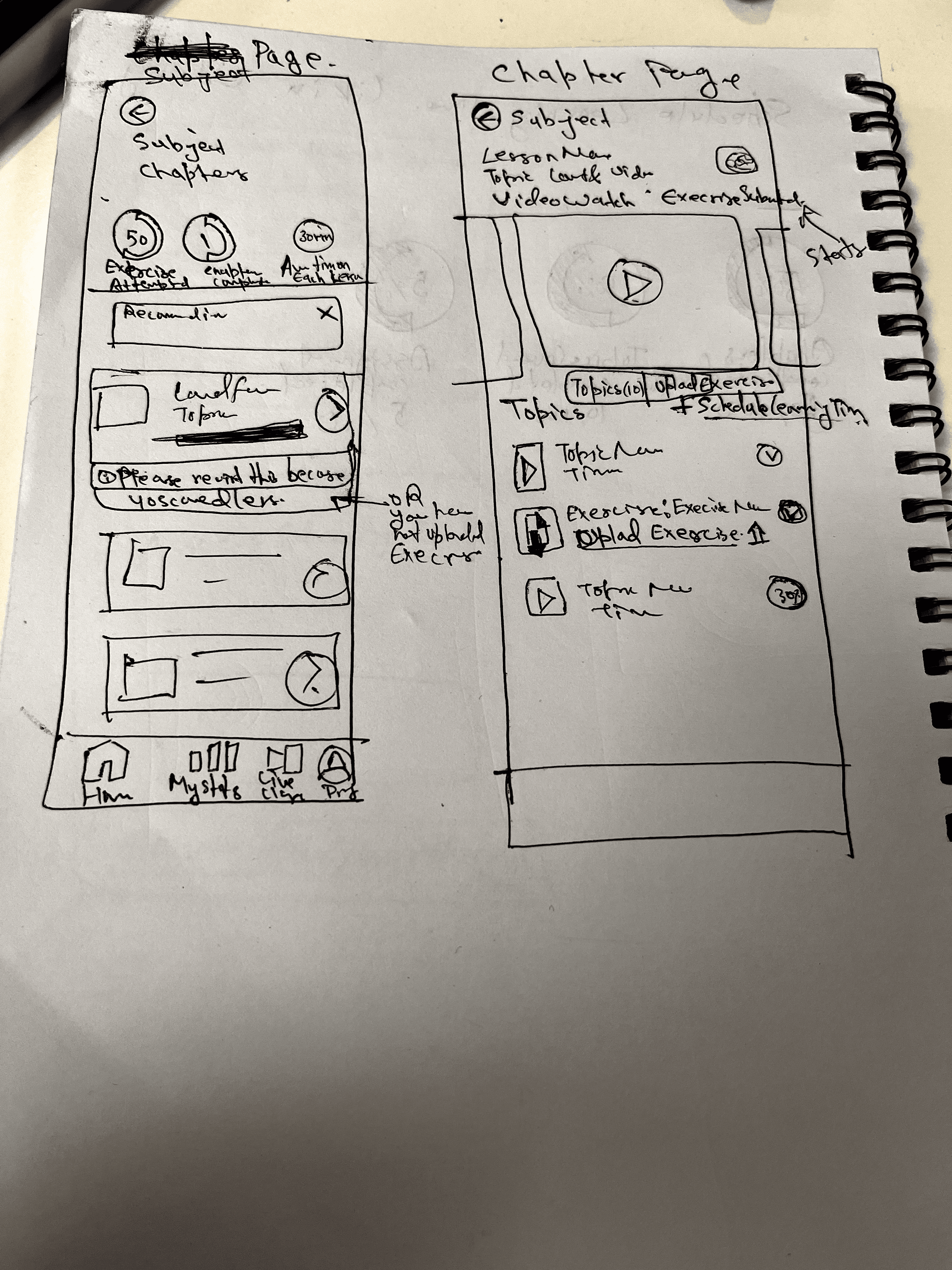
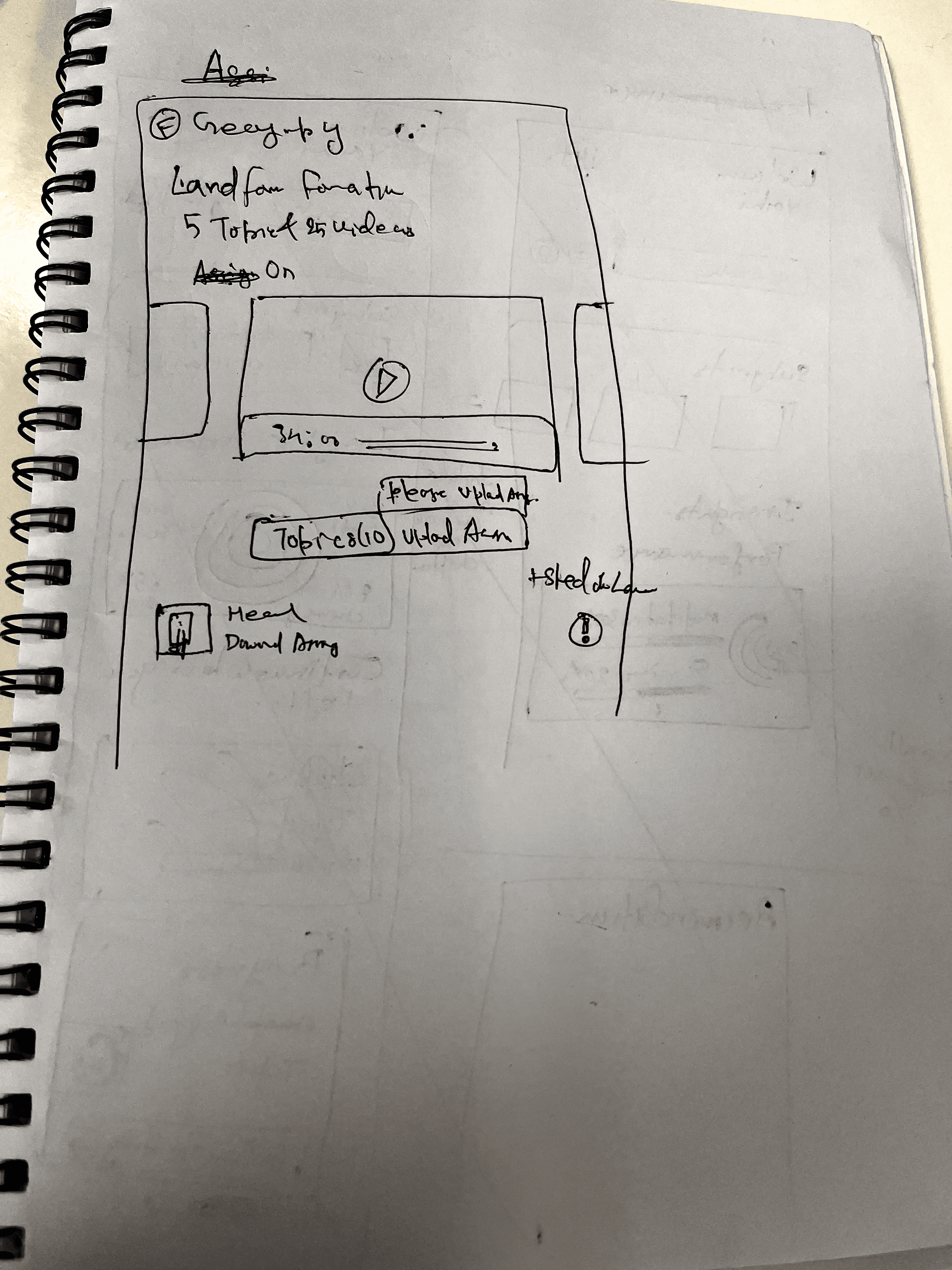
Low-Fidelity Wireframes
I started sketching out the basic layout and functionality based on the user's tasks. This early stage helped me gauge the overall flow and usability of the design. It was a quick and effective way to test different ideas without getting bogged down in details.

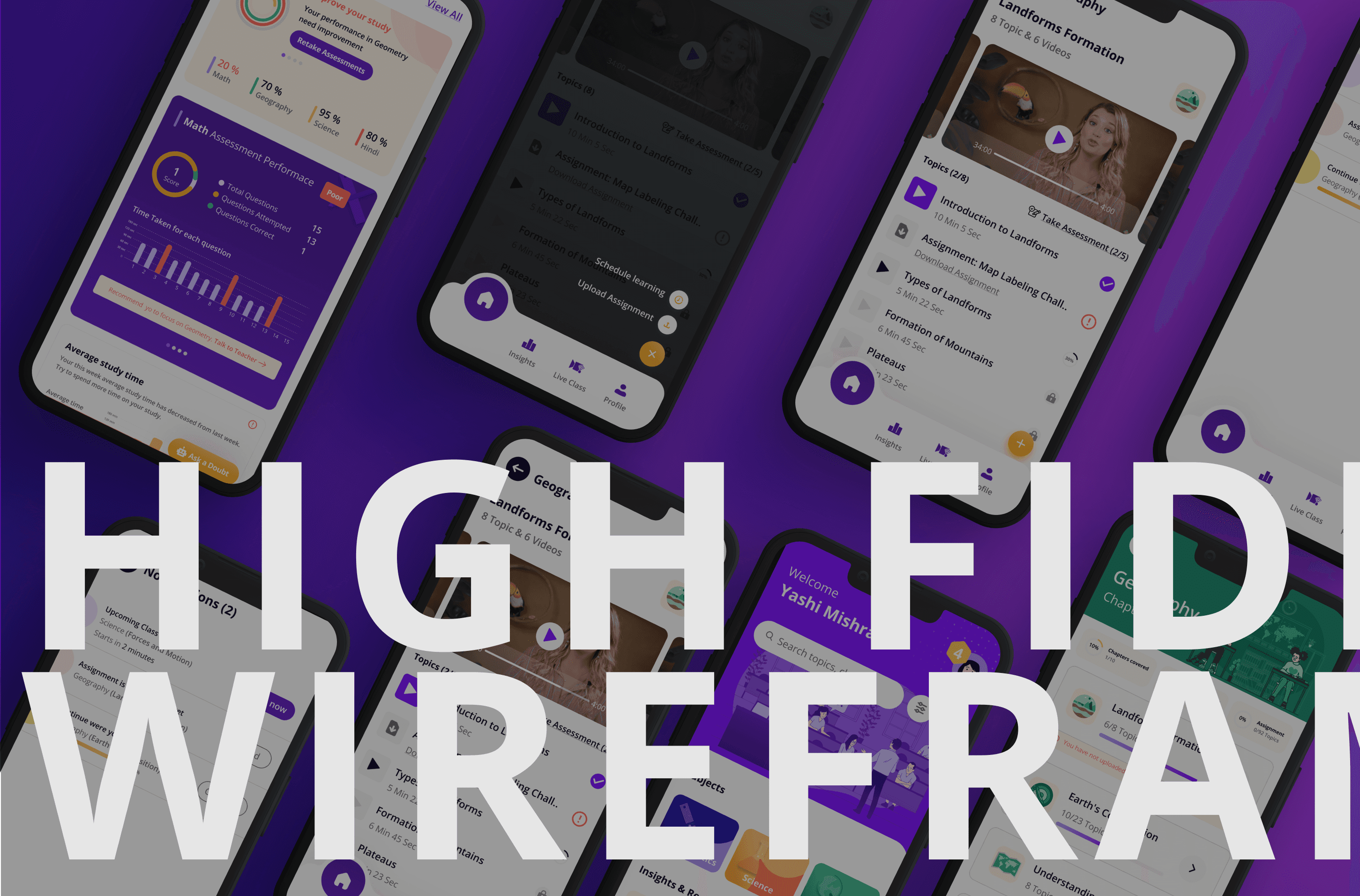
Mid-Fidelity Wireframes
Now that I had a general idea of some of the specific tasks the user wanted to complete, it was time to begin the design process. I used the wireframe structure to create a low-fidelity prototype. This was useful when determining how enjoyable and functional the current design was during this stage.


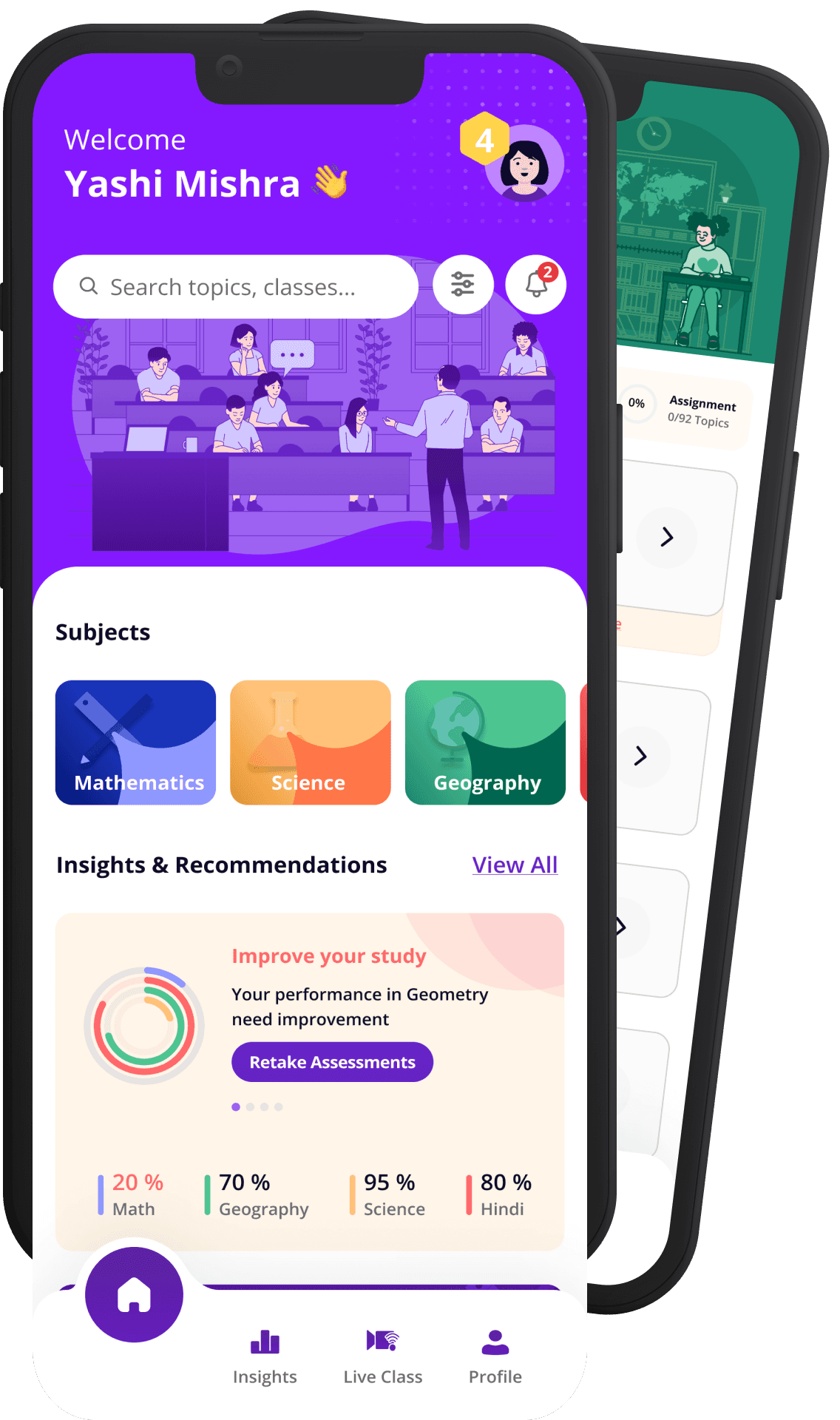
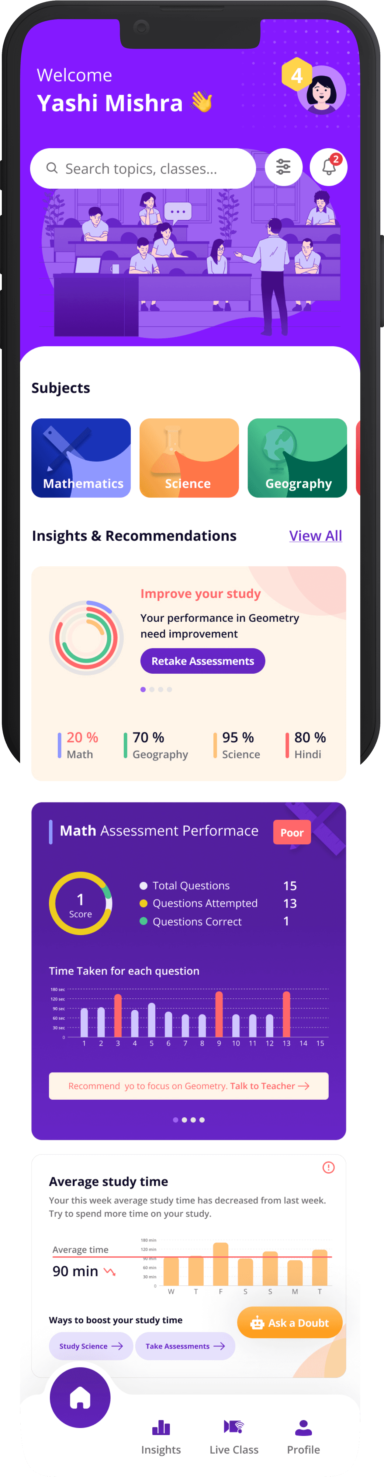
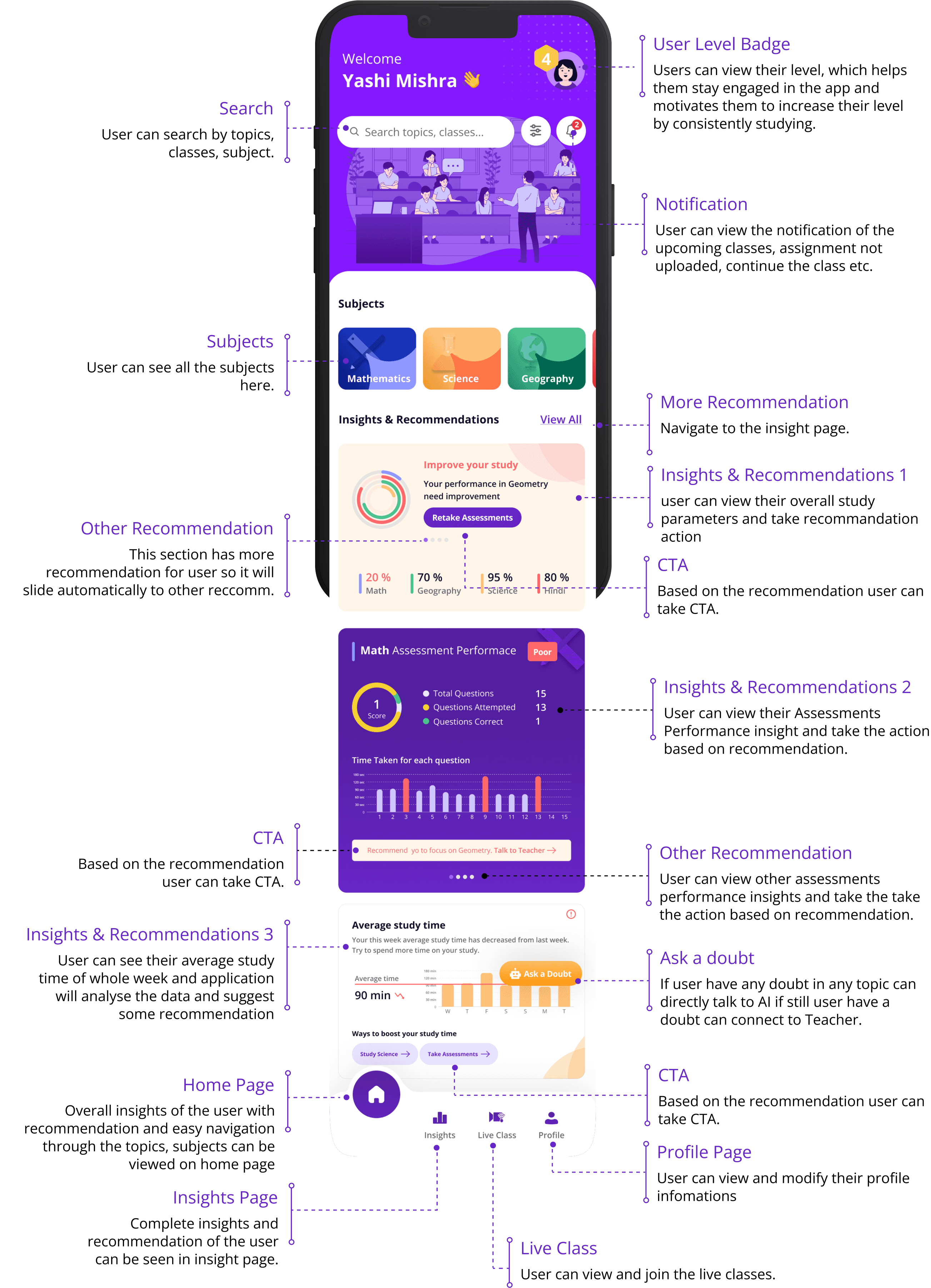
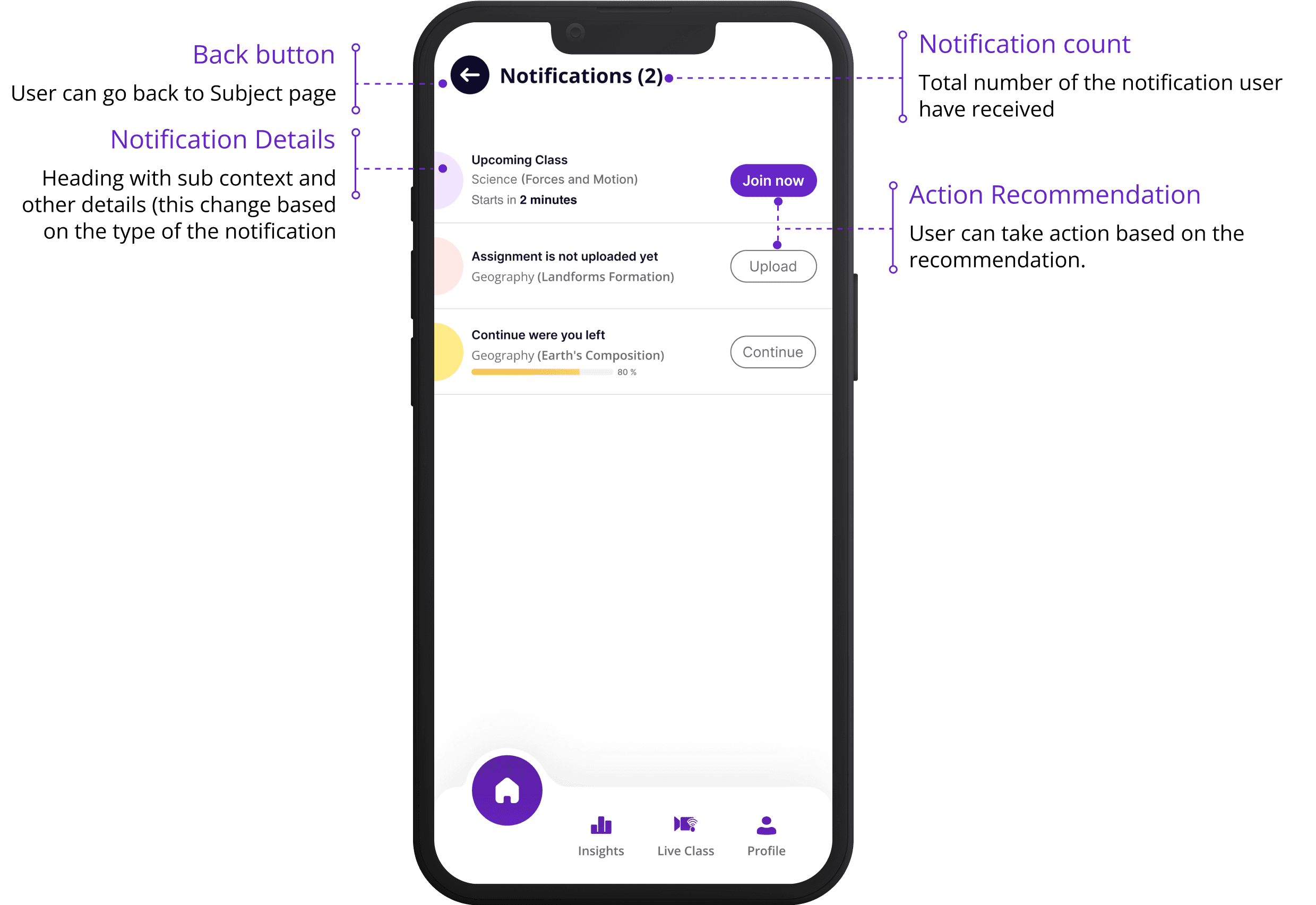
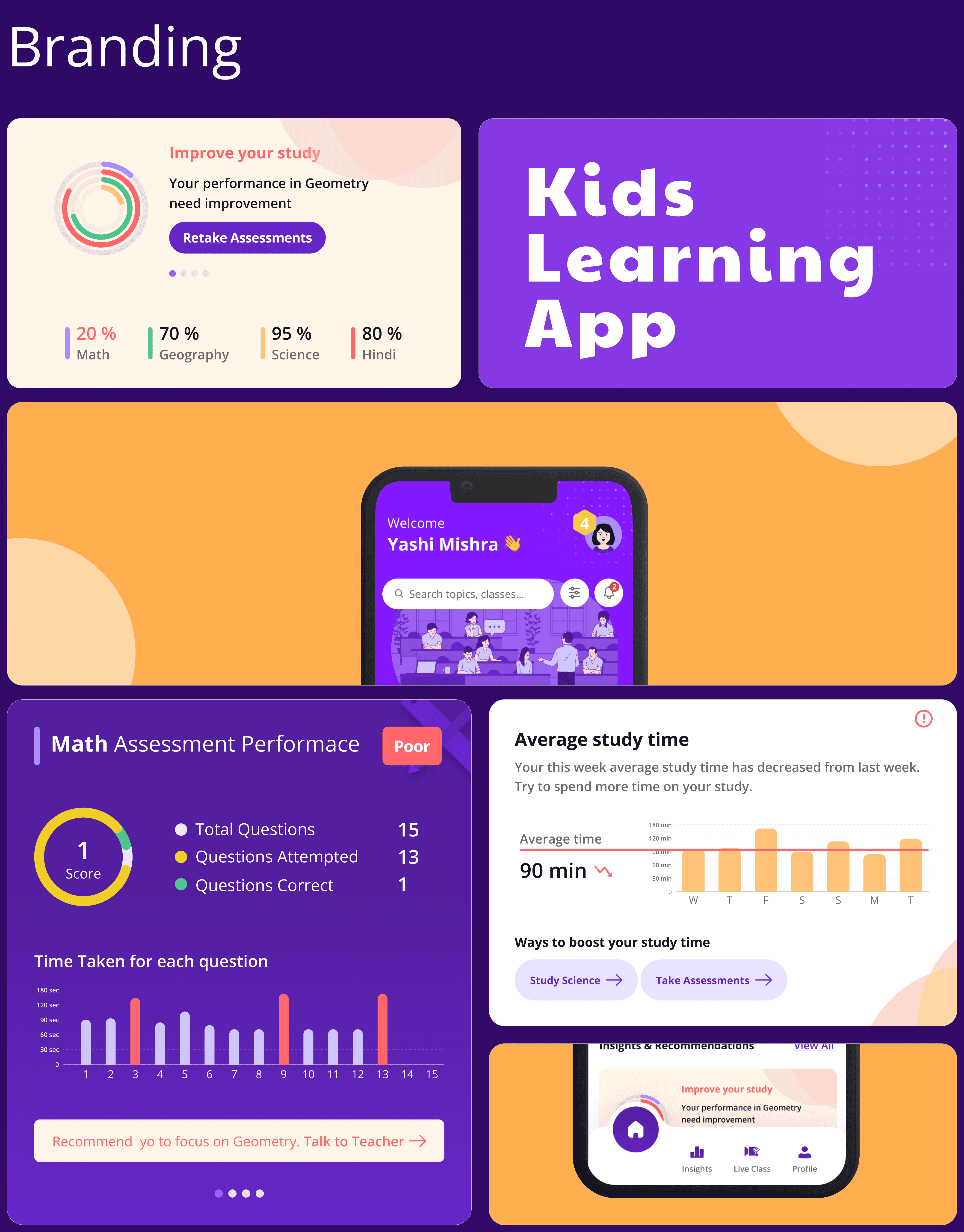
Home Page
The home page provides users with a comprehensive overview of their study insights and recommendations which helps the user to improve their study, thereby keeping them engaged with the app.

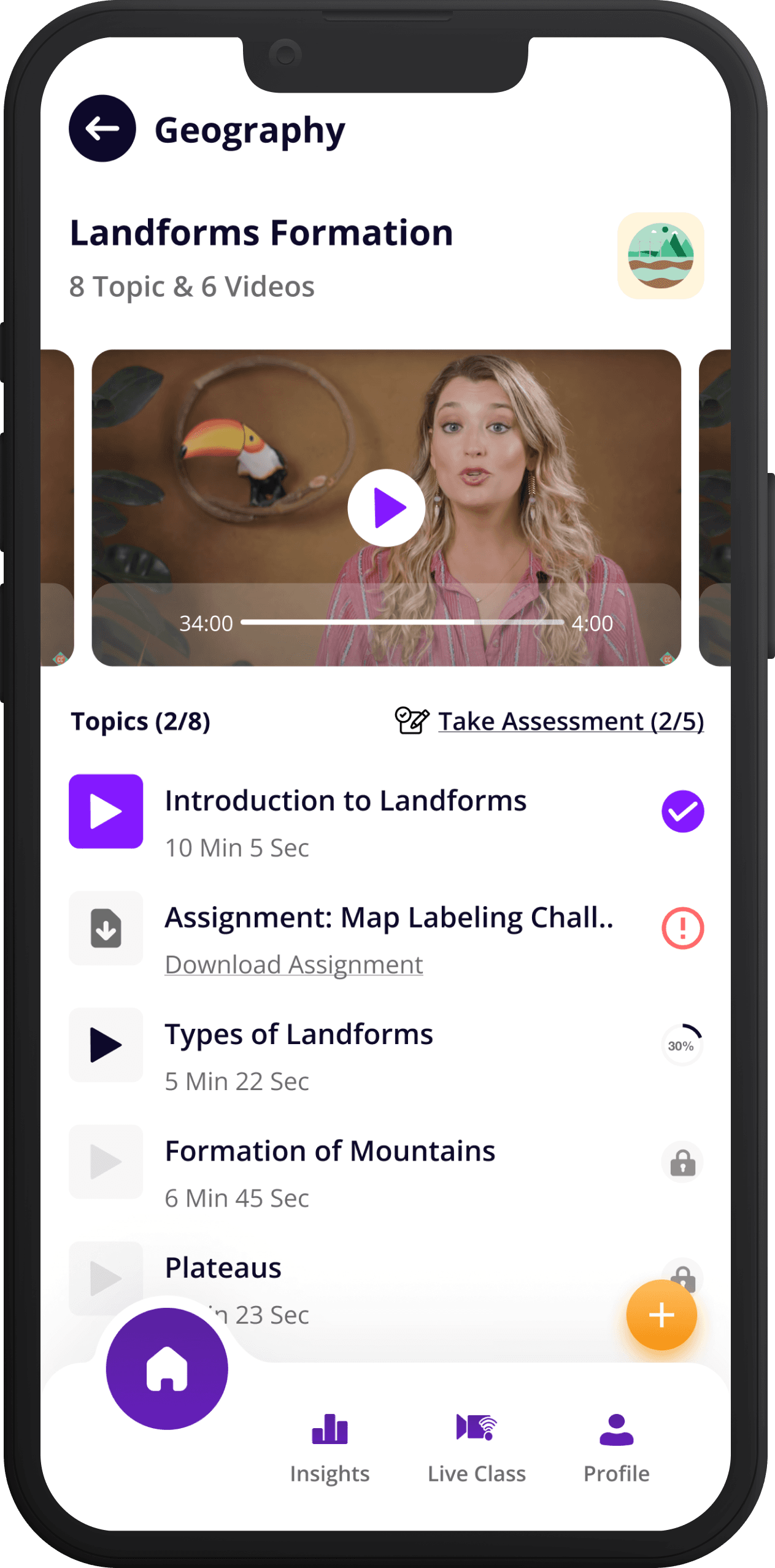

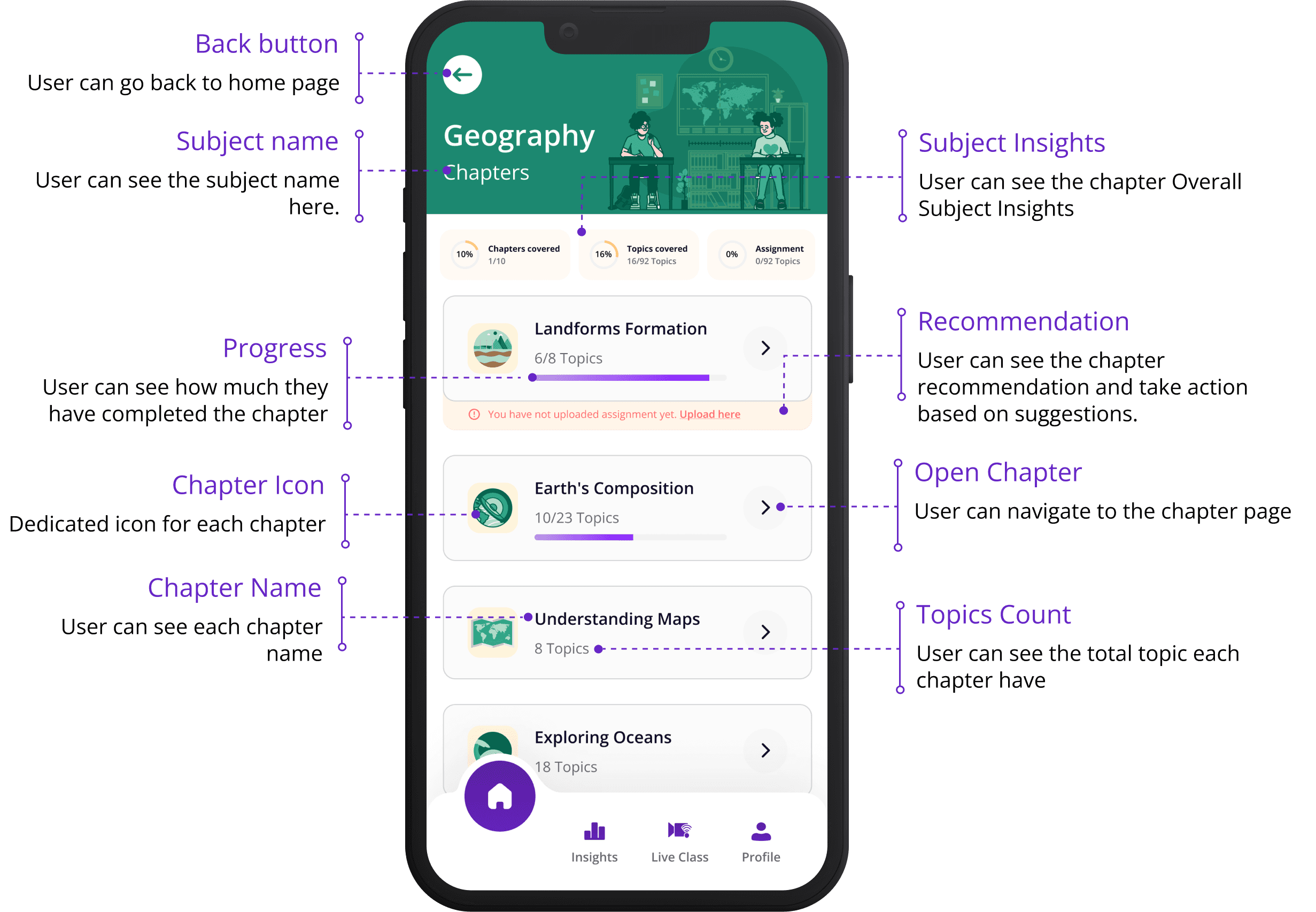
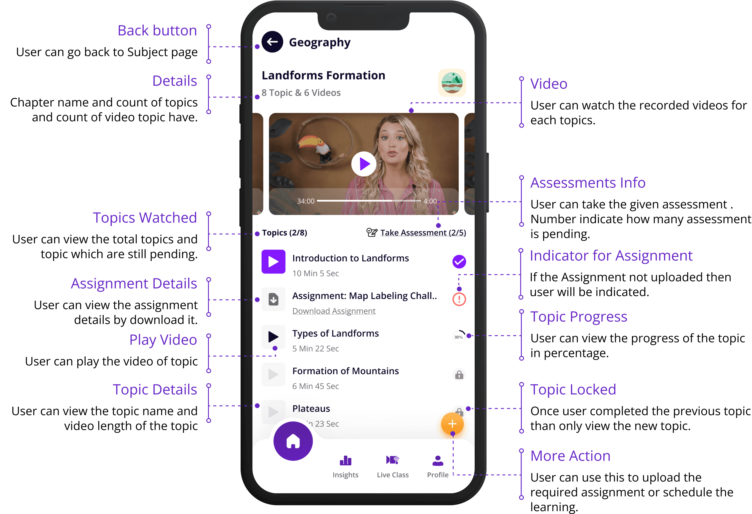
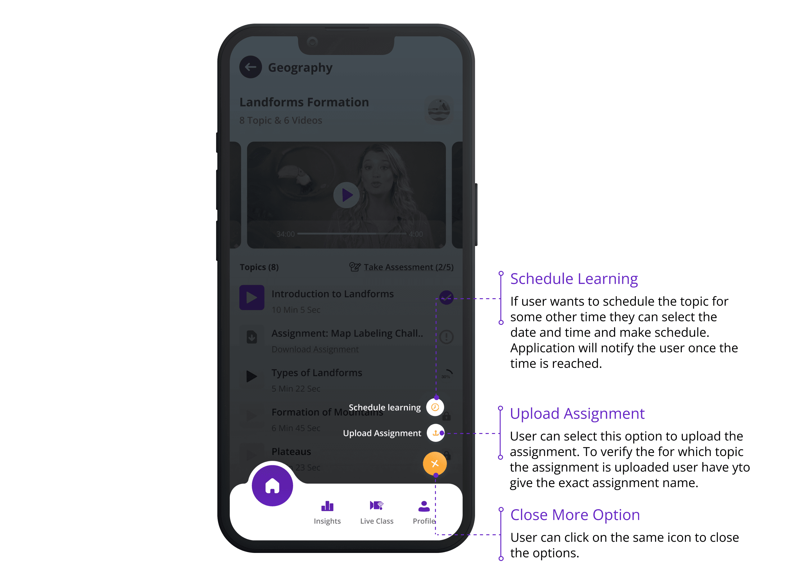
Screen Breakdown
I detailed all the key components of each screen, including navigation elements, buttons, input fields, and content areas. This comprehensive analysis ensured that every necessary feature was included and properly placed. It also provided a clear overview of how users would interact with the interface, making it easier to identify and address potential usability issues early in the design process.
Case Studies

Drawing boxes since 2020
Thank you for your interest in my work. Lets connect!